Commercial Art: Travel Posters in Special Collections
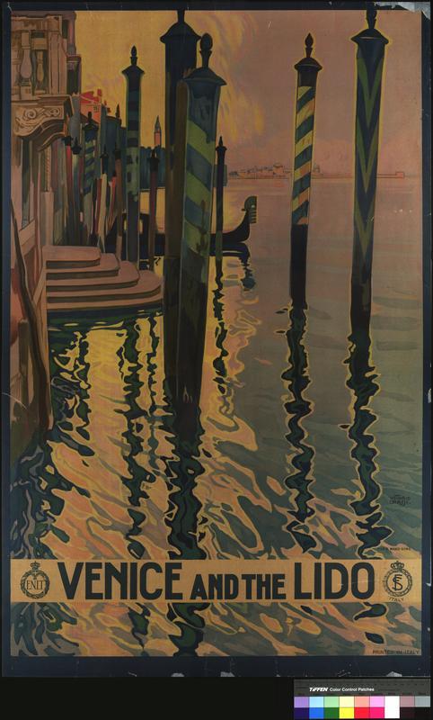
Venice and the Lido

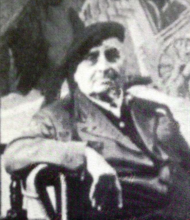
Photograph of Italian, Vittorio Grassi. An artist, painter, illustrator, and designer, who was commissioned for the Venice and the Lido lithograph backed on linen.
Native-born Italian Vittorio Grassi (1878-1958) was a “painter, illustrator, engraver, and designer. He co-founded the Facoltà di Architettura (Faculty of Architecture) at the University of Rome, where he was also a teacher.” Grassi designed glass windows at the Church of St. Peter and St. Paul in Rome, as well as being commissioned for several travel posters in magazines and on railways.[1] His career painting posters for railways began when Grassi was commissioned by École Nationale d'ingénieurs de Tarbes (ENIT), also now known as Agenzia Nazionale del Turismo (The Italian Government Tourist Board). He was asked to paint posters to attract tourism to the Lido because of his prominence in the art community of Italy. In Italian Design by Giampiero Bosoni, he coins Grassi as one of the most influential artists in Italian design: “An estheticizing vein dedicated to re-creating an idealized Italian primacy in the arts coexisted with an emerging social awareness that directed Art Nouveau toward a wider public—including the working class, which desired a simpler more communicative means of expressions.”[2] According to Bosoni, Grassi was one of the artists that helped to spread the lithographic art style through Italy. Through his un-traditional use of Art Nouveau Grassi sought to encapsulate the history of the Lido and attract tourists in a post-war economy that was declining rapidly.

Lido de Venezia. From the travel poster collection provided by MU Ellis Libraries digital collections
The Venice and the Lido poster is a lithograph backed on linen, printed around the year 1920. Grassi’s poster looks to capture the immense history of the Lido and it was done so through the Art Nouveau technique--which was scarcely used at the time of the lithograph’s commissioning. Art Nouveau was a, “…push towards new art that was neither a servile copy of the past nor an imitation of foreign taste.”[3] Grassi, unlike his other colleagues sought to push the boundaries of traditional art. We can see Art Nouveau in the free-handedness of the lines, or rather the organic forms that take place on the poster. Unlike the building featured in Fraipont’s, Chateau de Chantilly, there are no sharp lines, bold color, or machine-like shape. Grassi included the mooring poles (or paline de casada) when he could have just left them out so the viewer can grasp the fullness of the Lido. He sought to capture the entirety of the image of the Lido and he included these because the striped mooring poles (featured in the poster), versus the wooden ones (often found around the entrances to palaces), were used to mark where it is deep enough for a full-sized boat or ship to pass through. In a way, Grassi is able to give us a bit of the history of the Lido without presenting it fully. The use of the gondola in the background is meant to spike the viewer's interest so that they will look further into the canal and the offerings of the waterfront Lido. As we can see in his poster, Grassi does his best to keep harmony with the natural surroundings and only uses ornamentation (like on the building) when necessary. Rather than have flashy, bright colors and ornamentation, he draws on the natural beauty of the Lido to have people question the ENIT organization further.
[1] 60 Great Travel Posters. United Kingdom: Dover, 2010.
[2] Bosoni, Giampiero. Italian Design. New York: Museum of Modern Art, 2008. pg. 17
[3]Charles, Victoria. "Art Nouveau." Google Books. Accessed December 02, 2020. https://books.google.com/books?id=Lqf8c2OT1OAC&newbks=0&lpg=PA1&dq=art nouveau&pg=PA1#v=onepage&q=art nouveau&f=false pg. 14