Commercial Art: Travel Posters in Special Collections
The Rhine
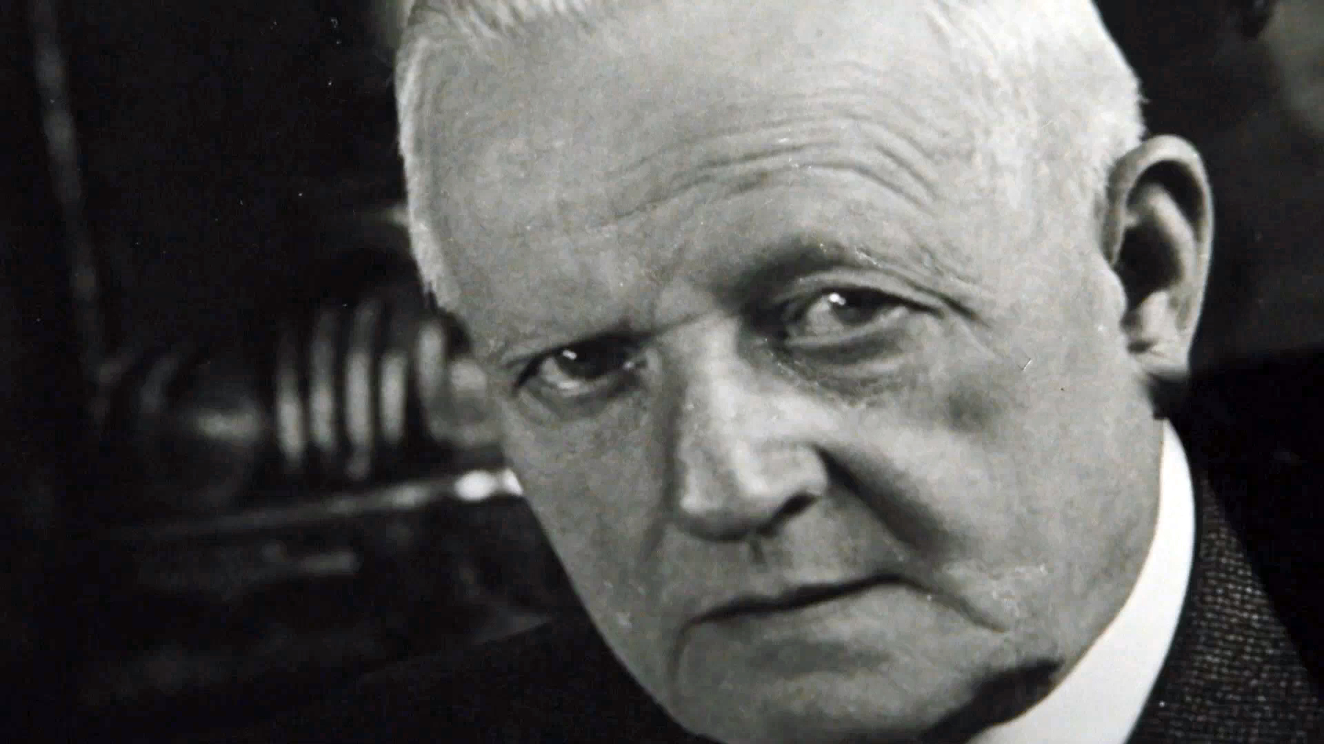
Consider while looking through this collection: Much is revealed in who was creating these travel posters. Whose voices were amplified in connection with tourism and national identity? Who was afforded the opportunity to distribute their art publicly? Ludwig Hohlwein is a difficult figure to discuss, since his influence in the world of German poster design makes him unavoidable in discussions of the topic, yet he was, also unavoidably, a member of the Nazi party who used his platform as an artist to create propaganda and encourage other artists to join the party alongside him.[1] Post-war, he was banned from creating art in Germany. This proved temporary, however, and he later returned to work as a commercial artist.[2]
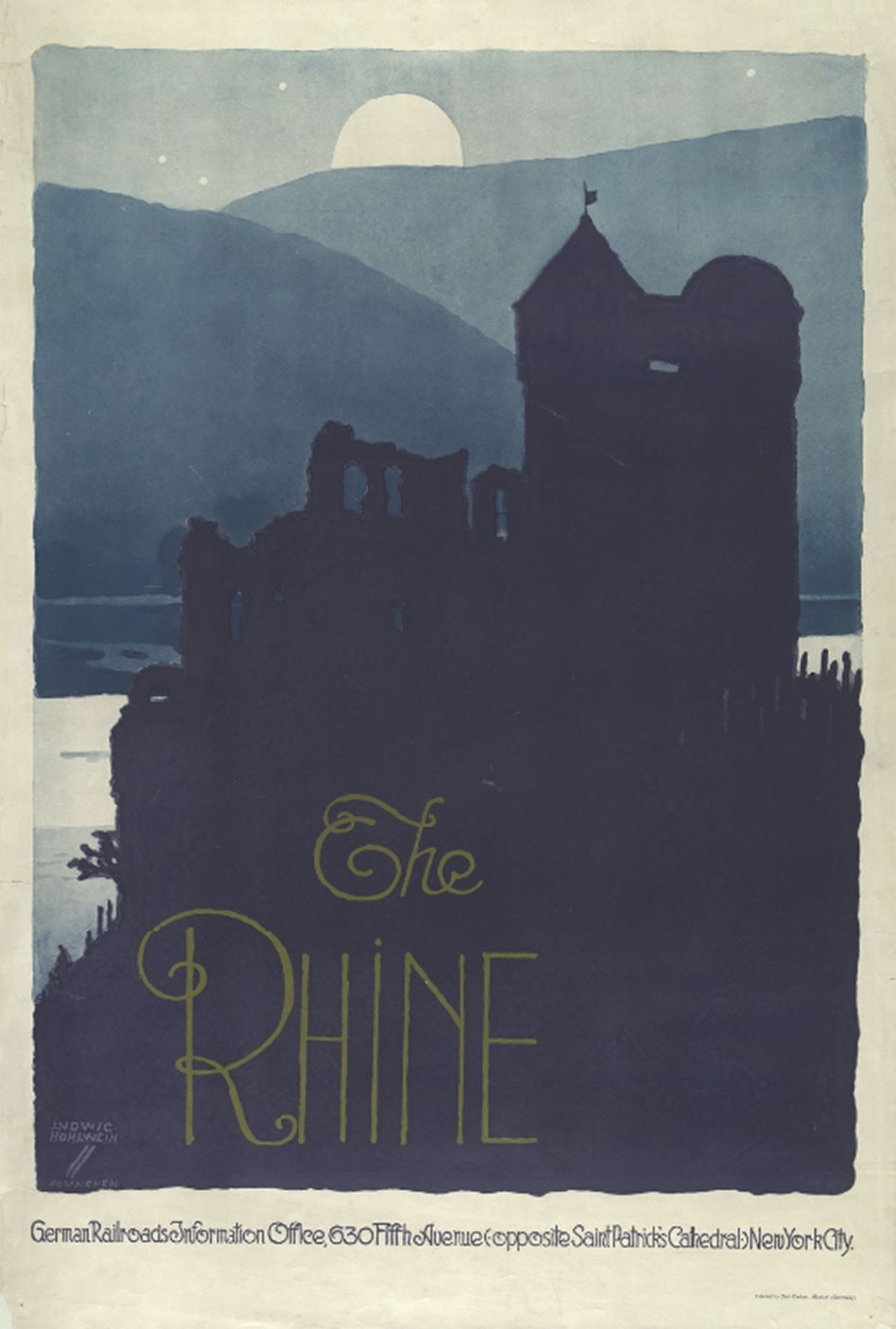
The flat areas of solid color used in this poster, created by Hohlwein and published by the German Railroads Information Office, are reminiscent of Art Deco as well as Plakatstil, or the German “poster style,” which emphasized striking, simplified shapes. Also notable is the hand-lettering, which contrasts with many of the other German posters in the collection. Here, the text is thin and delicate, with decorative curls. Compare the poster of Lichtenstein Castle in Württemberg, lettered in a bold, square typeface, not a Gothic font but one which, because of its heaviness and “blackness,” is stylistically much closer to one. Hohlwein’s more delicate lettering choice interacts with multiple social issues in Germany at the time, primarily the rise of Nazism and the fall of German Blackletter.
In the 1920s and 30s, features of text design were heavily associated with masculinity or femininity, class status, and nationality. This was not a new idea at the time. Giambattista Bodoni, creator of the Bodoni typeface in the late 18th century, is quoted as saying, “The beauty of letters consists in their regularity, in their clearness, in their conformity to the race, nation, or age in which the face was first written,” exemplifying a way of thinking that had been long-established by Bodoni’s time.[3] Germany, however, associated typeface with national identity perhaps especially strongly, since the German language had been written in Blackletter for centuries by this point. The rise of the Nazi party changed this – initially embracing the style, they later abandoned it, with Adolf Hitler declaring it a “Jewish letter” in a private memo and forbidding its use in official documents in 1941.[4]
This poster dates to the 1920s, so its use of thin sans serif letters likely has more to do with personal artistic direction or influence from emerging art movements (such as New Typography, a push for more modern type design in contrast with the “antiquated” blackletter) than with Adolf Hitler. Still, this illustrates how the cultural weight attached to these design choices could change rapidly, and the context in which an advertisement was created can reveal meanings not obvious on the surface.
[1] Clifford, John. “Graphic Icons: Visionaries who Shaped Modern Graphic Design.” Pearson Education. 2014.
[2] "Ludwig Hohlwein". Olympedia.Org, 2020, https://www.olympedia.org/athletes/920645.
[3] Frazier, J. L. Type Lore. [S.N.], 1925.
[4] Heine, Werner. "‘Futura’ Without A Future: Kurt Schwitters' Typography For Hanover Town Council, 1929–1934". Journal Of Design History, vol 7, no. 2, 1994, pp. 127-140. Oxford University Press (OUP), doi:10.1093/jdh/7.2.127.


