Commercial Art: Travel Posters in Special Collections
Tarragona
Regenerationism was an intellectual movement specific to Spain which began its development in the years after the nation lost its last colony in America in 1898. The movement questioned the common romanticized image of Spain’s past, and sought to address concrete problems in its present, leading to the development of the Patronato Nacional de Turismo, or the National Tourism Board.[1] If Spain was to encourage tourism, however, it must also advertise itself strategically, using this opportunity to combat Spanish stereotypes that had arisen throughout the rest of Europe.
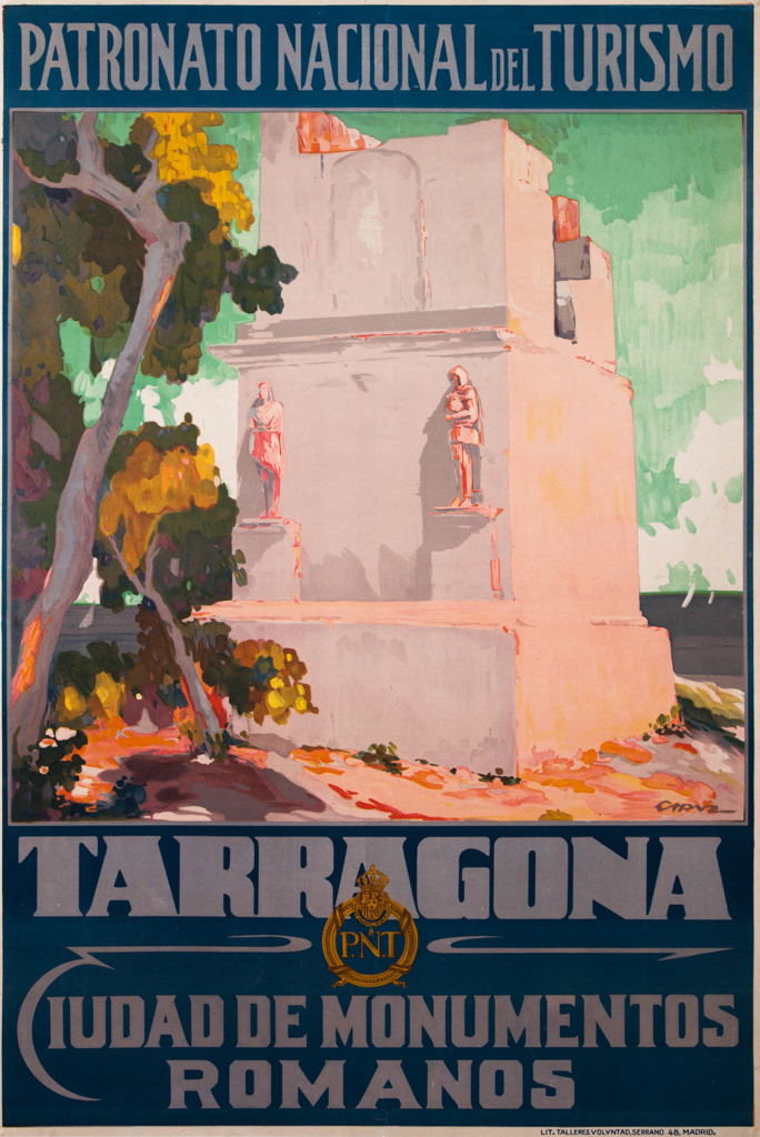
Around 1930, the Spanish National Tourism Board released this poster, advertising the Tower of the Scipios in Tarragona, created by Pascual Capuz Mamano. He was brother to sculptor Jose Capuz, and though the pair are lesser known to English-language publications, they have been referred to as (paraphrased from Spanish) “one of the best poster artists of the first quarter of the 20th century” and “the most brilliant sculptor of the new generation,” respectively.[2][3] The broad, square type style here is characteristic of Capuz’s posters, of which he made many advertising Spanish events and monuments. As a painter and a graphic artist, Capuz’s style has been identified with Valencian Regionalism and Regenerationism, but also with Modernism and Art Deco.
The years after the advent of the Patronato Nacional de Turismo, during which Pascual Capuz was active as a poster artist, are regarded as a “golden age for tourist posters in Spain.”[4] Artists commissioned by the Patronato were allowed to choose their own media and colors, but certain guidelines were placed on the size and placement of the type on the page. It can be inferred that this was due to concerns over legibility and cohesiveness, as well as keeping with the style established by other European tourism campaigns, with which Spain was now competing. The typography used in these posters was, according to Raquel Pelta Resano, typically modern and sans serif.[5] While the lettering on the Tarragona poster does include serifs, it is decorative and geometric, in line with the spirit of the Patronato’s campaign. Its shape also mirrors the shape and style of the ruins depicted on the poster.
Against the low-contrast, dark-colored frame containing the poster’s text and the emblem of the Patronato Nacional de Turismo, the illustration of the ruins is striking. Its colors are highly saturated, the vivid orange shadows and the warm tones in the trees giving an impression of summer heat and light. Even the sky foregoes a cool blue for a warmer, greener tone. The vibrancy assures the viewer that this is a pleasant, not an overpowering, heat. Though Spain was, at the time, new to the game of travel advertising, this poster is a strong contender against those of the other major publishers.
[1] Pelta, Raquel. "Beautiful All Year Round." The Regenerationist Image Of Spain In The Posters Of The Patronato Nacional De Turismo. University Of Barcelona, 2014, https://www.researchgate.net/publication/279199191_Beautiful_all_year_round_The_regenerationist_image_of_Spain_in_the_posters_of_the_Patronato_Nacional_de_Turismo.
[2] Aguilar Civera, I. and Hermosilla Pla, J., 2009. La Ciudad De Valencia. València: Universitat de València, pp.408-416.
[3] Cerdá, Manuel. Gran Enciclopedia De La Comunidad Valenciana. Prensa Valenciana, 2005.
[4] Pelta
[5] Pelta

