Commercial Art: Travel Posters in Special Collections
Norway: The Land of the Midnight Sun
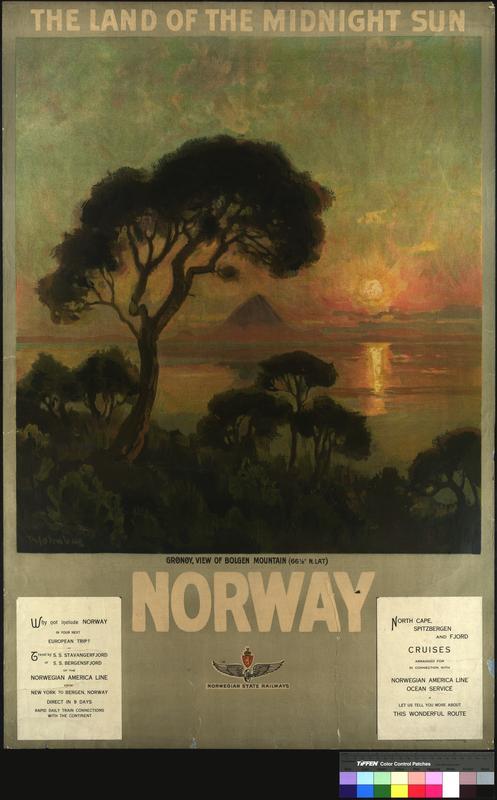
Although the phrase “Midnight Sun” may seem like an oxymoron, the summer months in the areas above the Arctic Circle and below the Antarctic circle prove it to be true. In these areas, the sun remains visible in the sky well into the night. To many this is simply an interesting scientific phenomenon, however, many Northern European countries, including Norway, use it as a landmark for individuality to draw in foreign tourists. The following travel posters, drawn by artists Thorolf and Othar Holmboe, used this slogan as their title. Through their soft, naturalistic depictions of unique Norwegian imagery and intriguing slogan, Thorolf Holmboe and Othar Holmboe created two successful travel posters for the Norwegian State Railway.
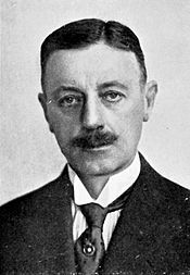
Thorolf Holmboe (1866-1935) and his brother, Othar Holmboe (1868-1928), were born in Vefsn, Norway. Before World War I, both brothers pursued art as a career, often working in tandem or on similar projects. The brothers were commissioned by the Norwegian State Railway, or NSB, to create travel posters to boost Norwegian tourism.
Thorolf and Othar Holmboe trained under many artistic styles, from romanticism, to naturalism, art noveau, and even impressionism. Both worked primarily as illustrators, until after World War I, when Th. Holmboe pivoted to painting and O. Holmboe left the art community to continue his pharmacy career.[1] [2]
In his time, Thorolf’s talent was recognized, but his variance in style was critiqued as superficial and pedestrian.[3] Today, Thorolf Holmboe is considered a successful Norwegian painter and many of his works are now exhibited in the Norwegian National Museum.
Thorolf Holmboe’s Norway: The Land of the Midnight Sun poster depicts the Grønøyfurua, or the Grønøya Pine, on the island of Grønøya in the Meløy municipality. Behind the Grønøya Pine in the poster is the island Bolga, and its mountain Bolgtinden. Both are warmed by a sunset reflecting on the large body of water between the two islands. On the bottom left of the poster is text describing the ships used in the Norwegian America Line and departure and arrival locations for those ships. Opposite this is more text urging the viewer to visit the Norwegian Travel Agency to learn more about the trip. The border of the poster complements the design's desaturated pallette, creating a calm artistic atmosphere. The main text is bolded and in a simple sans-serif font, while the descriptive texts draw the reader further into the world of the poster by using a more decorative serif font.
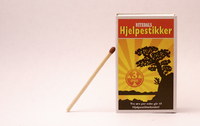
The Grønøyfurua from the poster became the symbol of the Norwegian match brand Nitedals.[4] Its standing as the symbol of Nitedals matches and its depiction in Th. Holmboe’s travel poster launched the tree Norwegian public eye. The tree was then given the name Fyrstikkfurua, or Match Pine. It was a tourist attraction and beloved by those who resided in Grønøy. Unfortunately, the Match Pine was destroyed in 2015 in an act of vandalism.[5]
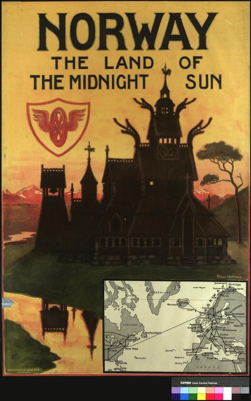
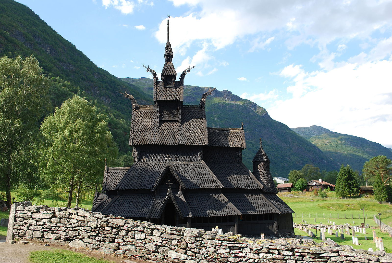
Othar Holmboe’s poster highlights his sketchy, realistic aesthetic while maintaining the Naturalistic style. O. Holmboe’s poster features the Borgund Stavekirke, or Borgund stave church, a type of architecture native to northern Europe. The poster silhouettes the stave church against a bright sunset. In the background is a mountainous landscape, a pine tree, and a body of water that moves its way into the foreground of the poster.
Hallmarks of the stave architecture are structures made entirely of wood and deep pitched roofs that overhang one another. Though 1000 to 2000 were thought to be built, only 28 remain standing in modern times. Most of the surviving stave churches were built between 1150 and 1350 A.D. and are located in Norway.[6] The Borgund’s destruction was prevented in 1877 by the National Trust of Norway, who purchased the church, which now functions as a museum.[7]
Holmboe did not forsake detail in his depiction of the church’s exterior wooden decorations. Four dragon heads and arching ridge crests are located along the roof ridges and at their ends. Though the Borgund stave church functioned as a Christian church for much of its years, these dragon heads serve as a nod back to Paganism and the Viking era.
O. Homboe could have chosen not to depict the dragon heads to appeal to the Western Christian audience, but he did not. This attention to detail, depicting the church as it was, rather than an idealized version, stems from Naturalism. The Naturalist painter placed great importance in depicting life as it was, rather than how it should be, which holds true in Othar Holmboe’s depiction. The serif font in the poster uses subtle decorative elements to mirror the architecture of the church as well as to balance the flared wings of the wheel.
Both posters utilize the winged wheel symbol to identify the Norwegian State Railway as the sponsor of the poster and to portray pride in the country’s progress in mass transportation. The winged wheel was first a symbol of the Greek god Hermes, but was later adapted to symbolize progress and speed, particularly in relation to railways.[8] Th. Holmboe’s poster combines the winged wheel with the Norwegian Coat of Arms, creating the Norwegian State Railway’s historical logo. O. Holmboe magnifies this symbol, pulling it to the forefront of his poster. The viewer of this poster is not only drawn to look at the beauty of the stave church, but to associate this symbol with the greatness and beauty of Norway.
In the Naturalistic fashion, the brothers tie their designs to rural life and nationalistic sentiments. Each focus on areas with little population and do not depict people, instead favoring the beauty of the Norwegian land, the land they grew up on. However, neither chose to concentrate this effect, as the foreign viewer can still admire and understand the subject. Both designs display landmarks that are rare or impossible to find in countries beside Norway. Th. Holmboe uses the muted Naturalistic palette to create a soft visual experience. O. Holmboe calls back to Romanticism, choosing a vibrant, idealized yellow as the main color to warm the sunset.
As a modern viewer we can see how the brothers succeed in portraying Norway as a worthwhile travel destination. Through their artful application of Naturalism, Thorolf and Othar Holmboe's Norway: The Land of the Midnight Sun posters displayed distinctive Norwegian icons and pushed forward a national identity of modernism and beauty.
[1] Linder, Mats. “Thorolf Holmboe.” Norsk Kunstner-Leksikon, Store Norske Leksikon, 1 Nov. 2019, nkl.snl.no/Thorolf_Holmboe.
[2] Ljsøne, Anne Grete. “Othar Holmboe.” Norsk Kunstner-Leksikon, Store Norske Leksikon, 3 Jul. 2013, nkl.snl.no/Othar_Holmboe.
[3] New-York tribune. (New York, NY) 18 May. 1919, p. 45. Retrieved from the Library of Congress, www.loc.gov/item/sn83030214/1919-05-18/ed-2/.
[4] Nitedals Tændstikfabrik." Store Norske Leksikon, 12 Jun. 2020, snl.no/Nitedals_Tændstikfabrik.
[5] Votvik, Johan. “Folk Gråt Åpenlyst Da De Ble Klar over at Fyrstikkfurua Var Blitt Sagd Ned.” Avisa Nordland, 24 Aug. 2015, an.no/folk-grat-apenlyst-da-de-ble-klar-over-at-fyrstikkfurua-var-blitt-sagd-ned/s/5-4-152950.
[6] "Stave Church." Wikipedia, 4 Dec. 2020, en.wikipedia.org/wiki/Stave_church.
[7] "Borgund Stave Church." Stave Churches, stavechurch.com/borgund-stave-churc/?lang=en.
[8] "Winged Wheel." Wikipedia, 1 Oct. 2020, en.wikipedia.org/wiki/Winged_wheel.
