Commercial Art: Travel Posters in Special Collections
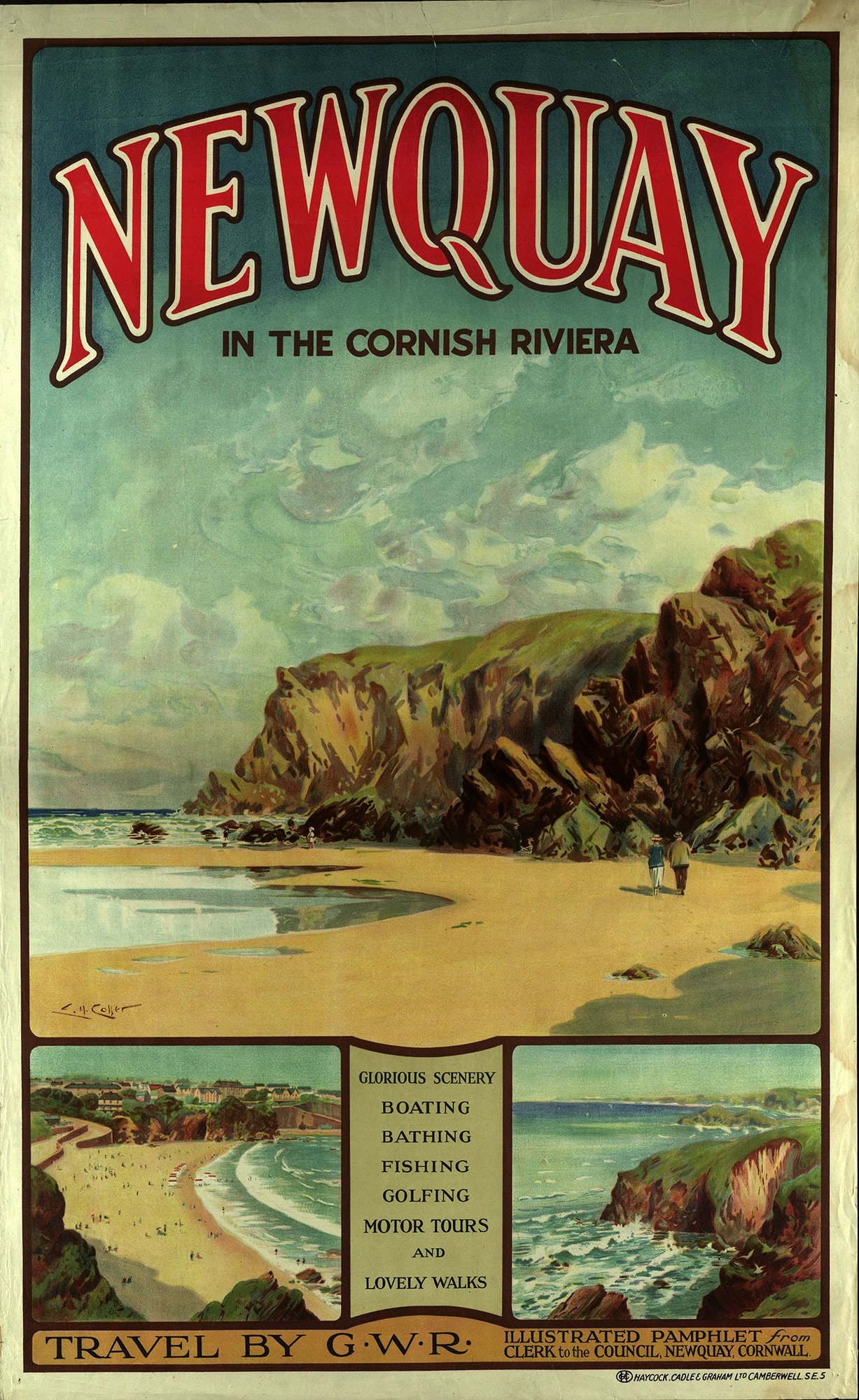
Newquay in the Cornish Riviera
From a present-day perspective, the typographic and design choices at work in this Cornish Riviera poster by L. H. Coller don’t seem out-of-place for an advertisement of the time, or even necessarily for a current one — many travel advertisements use multiple views of the same location in their layouts, for example. Throughout the 1920s, however, this design choice, a staple of Great Western Railway posters, was generally considered to look crowded and unappealing.[1] Various new art movements had appeared on the scene in this period — Art Deco and the German Plakatstil, or “poster style,” were particularly influential in advertising — and it is easy to see how, next to the bold art that characterized these movements, the painted scenery of the Cornish Riviera in this poster may have appeared old-fashioned by comparison.
One aspect of this poster, however, represented the new and forward-thinking: the sans serif type benearth the header. Older Roman-style typefaces (for a famous example, see Times New Roman) had all included serifs, and traditional Gothic faces were more complex still. The new popularity of sans serif fonts among artists was a departure from the norm, what Peter Bil’ak calls “the youngest model of letterform construction, (…) reactive, standing in opposition to traditional typefaces.”[2] In an example of pushback against these new fonts, one typographer active in the 1920s, J. L. Frazier, writes of sans serif fonts or “block letters” as unprofessional and suggestive of crude prehistoric engravings.[3] Despite criticisms like these, sans serif fonts have endured.
Some modern-day scholars have argued for more sophisticated readings of the Great Western Railway’s poster illustrations, analyzing, for instance, the way GWR used its advertising to influence how their customers saw the British landscapes being advertised.[4] This suggests that, as with other travel posters in the library’s collection, national identity was a concern for the Great Western Railway and its artists. This Newquay poster can be seen as an example of the difficulty in maintaining this national image in a poster while also balancing an appealing and artistically current aesthetic. It can also be read as a study in the simple changing of tastes over time.
[1] Cole, Beverly, and Richard Durack. Railway Posters 1923-1947. Laurence King, 1992.
[2] Biľak, Peter. "A Brief History Of Sans Serif Typefaces". Typotheque, 2019, https://www.typotheque.com/articles/a_brief_history_of_sans_serif_typefaces. Accessed 11 Dec 2020.
[3] Frazier, J. L. Type Lore. [S.N.], 1925.
[4] Medcalf, Alexander. “‘We Are Always Learning’: Marketing the Great Western Railway, 1921–39.” The Journal of Transport History, vol. 33, no. 2, Dec. 2012, pp. 186–211, doi:10.7227/TJTH.33.2.3.

