Places in the World: Treasures from the Venable Collection
The World: Science and Art
The only true map of the world is a globe. Transforming a three-dimensional sphere into a two-dimensional plane inevitably results some form of distortion. This can be mitigated by only mapping a small portion of the globe, but any attempt to depict the entire world on a flat map always results in some kind of distortion. The mapmaker therefore has to choose what kind of distortion will be included and how that can best serve the purpose of their map. For instance, Gerhard Mercator (1512-1594) developed a mathematical projection method that enlarged areas towards the poles — the Mercator projection magnifies Greenland to fourteen times its actual size — but also aided navigation by permitting the charting of straight-line courses.
The three maps in this gallery were drawn at a time when Europeans were only beginning to explore the rest of the world. As a result, they often include incomplete coastlines to acknowledge gaps in knowledge as well as annotations that indicate which traveler had first sighted a given location. Accurate information is essential for proper cartography, but the act of exploration commonly involved gaps. Sometimes, that meant that the gaps were filled with myths or theories: early European world maps commonly include a southern continent called Terra australis incognita (literally, “the southern unknown land”), Terra australis, or Magellanica, after the explorer Fernão de Magalhães (1480-1521) whose ill-fated expedition was the first to successfully circumnavigate the world. European geographers believed that there had to be a giant landmass to the south which provided a necessary counterweight to the landmasses in the northern hemisphere. As a result of this theory, the real southern continents of Australia and Antarctica were sometimes assumed to be parts of this theorized one.
As you look at these maps, think about them from a designer’s perspective, a blending of science and art. There were numerous scientific challenges inherent in depicting the planet on a single flat sheet of paper and although the maps may not be completely accurate, they are still easily recognizable as maps of the world. Artistically, the maps are all done to a very high standard, showing off the skill of the engravers and printers involved in their production. How has that fusion of science and art influenced the design? How have our tastes today changed?
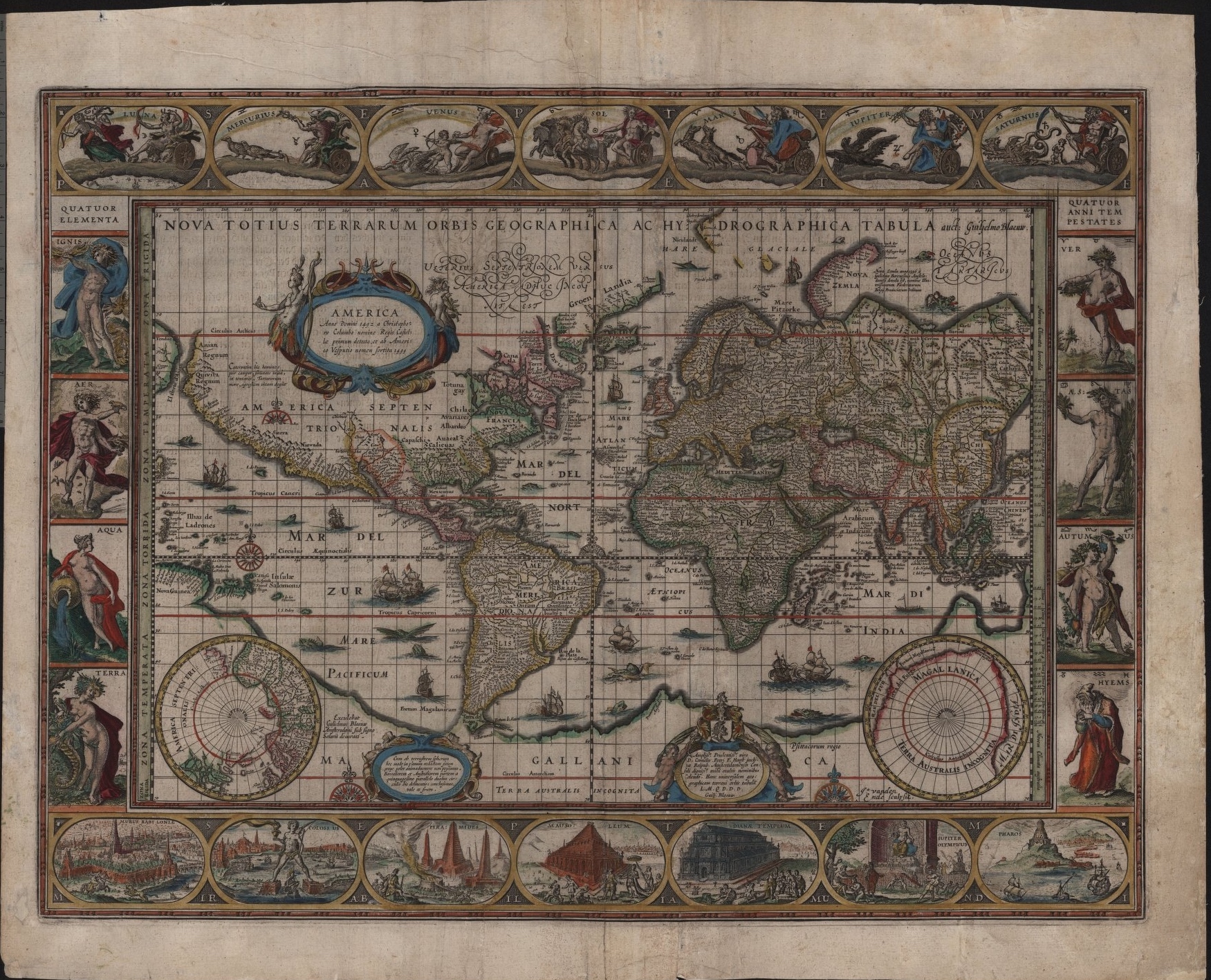
Nova Totius Terrarum Orbis Geographica Ac Hydrographica.
[Amsterdam, 1635].
Willem Janszoon Blaeu (1571-1638)
Nova Totius Terrarum Orbis Geographica Ac Hydrographica Tabula (A new geographic and hydrographic depiction of all the lands of the world) was printed as part of an encyclopedic atlas that contained not only maps but also text describing the areas being depicted, a genre of atlas dominated the market from the 1570s until the 1670s, when cheaper atlases without accompanying text became more common. When bound with the rest of its atlas, the map appears as a centerfold with text before and after it. The text on our copy is a complete essay in German that discusses the nature of the world, starting with its spherical shape and then discussing the different oceans and the New World. The author comments that the earth’s roundness is proven by all the classical authorities as well as by simply observation. They are also unimpressed by the name “America,” arguing that Amerigo Vespucci (1454-1512) had little to do with the discovery of the new continent, but they stop just short of advocating for a name like “Columbia,” likely because by the 1600s, the name “America” had more or less stuck.
The map itself, printed from an engraved plate and hand-colored, is heavily decorated with images of ships and monsters. The Americas are largely labeled with the names of European colonies, but the interior of North America, which is largely left blank, also features a few Native American names along the border with the Europeans. Another potentially interesting point is that whereas modern maps have only five oceans — the Arctic, the Atlantic, the Indian, the Southern, and the Pacific — Blaeu’s map does not differentiate clearly between seas and oceans, resulting in at least ten large bodies of water bearing some variation of the name “Mare” or “Oceanus.” Of these, only the Mar di India and the “Mare Glaciale” correspond to modern oceans, a reminder of the difficulty inherent in drawing clear divisions between bodies of water.
The map also has a fascinating border of images, depicting the seven classical wonders of the world at the bottom and anthropomorphized representations of the four elements (left), the currently recognized celestial bodies (top), and the four seasons (right). The figures are almost all male, with the exception of Water, Earth, the Moon, and Venus. The planetary figures are based on Roman deities but the elements show off an interesting quirk of Galenic humoral theory, namely the belief that heat and dryness were masculine whereas cold and moisture were feminine. Water and earth were therefore the elements associated with women. The decorations are an interesting example of how broader cultural ideas found their way into documents on other topics.
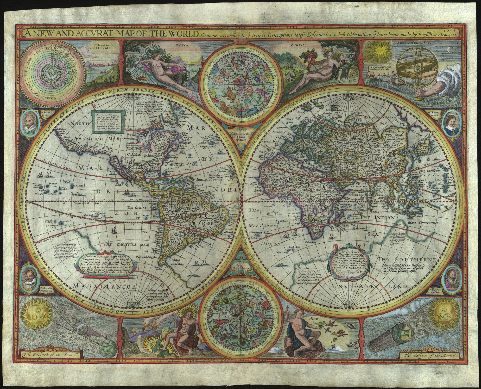
A New and Accurat Map of the World Drawne according to ye truest Descriptions lastest Discoveries & best observations yt have beene made by English or Strangers.
London, 1651.
John Speed (1551/52-1629)
This map first appeared in A Prospect of the Most Famous Parts of the World, published by George Humble in 1627. George Humble had previously printed Speed’s The Theatre of the Empire of Great Britain, a pioneering work that mapped English counties and maps. The Prospect was a very “English” atlas: it is the first world atlas by an Englishman (though not the first world atlas to be published in England) and does not appear to have circulated much outside of England. It is unclear just how involved Speed was in its production, as he had gone blind in 1625 and the Prospect’s organization in general is not as meticulous as one might otherwise expect from Speed. The map was engraved, possibly by Abraham Goos (fl. 1614-1643), and then hand-colored for sale.
A New and Accurat Map of the World includes Terra australis incognita, labeled “Magallanica” on the western hemisphere and “the southerne unknowne land” in the east. It incorporates Tierra del Fuego and Australia into the continent, noting sightings of land as being part of the unknown continent. It also presents California as an island, a common 17th-century error that we will see repeated in some other maps of the western hemisphere represented in this exhibit.
Among the map’s many other interesting features is the presence of fanciful astrological illustrations around the borders of the map. The illustrations mainly represent pseudo-scientific phenomena like the Zodiac or the four classical elements, but they also include the celestial mechanics responsible for producing eclipses, which hints at the importance of scientific astronomy for mapmaking. Mapmaking — and especially global mapmaking — required considerable astronomical skill since the main way to calculate longitude relied on being able to precisely calculate local time.
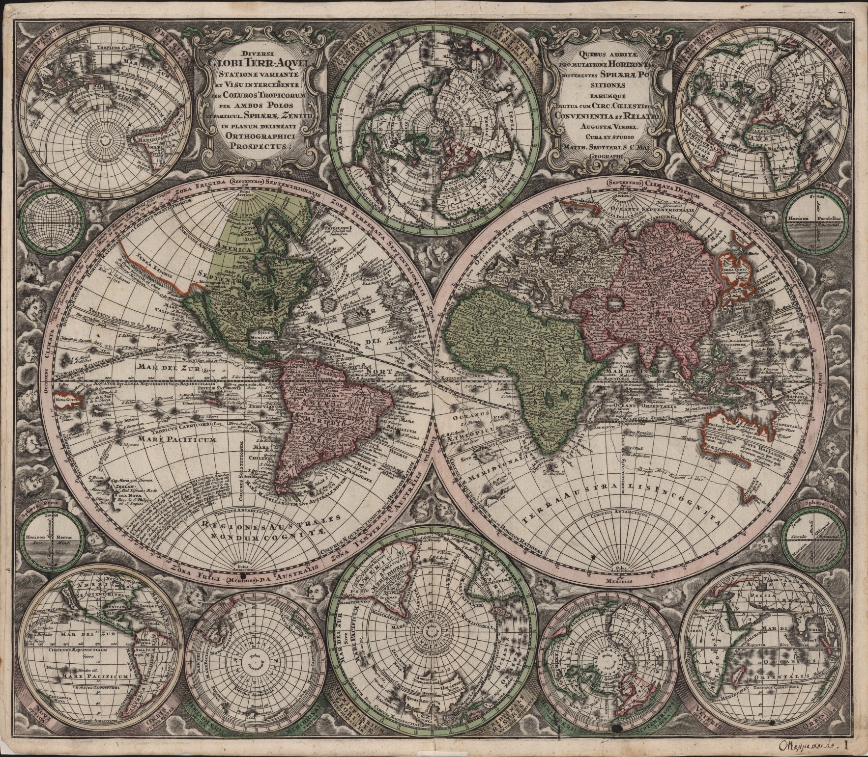
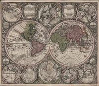
Diversi Globi Terr-Aquei Statione variante et Visu intercedente.
Augsburg, ca. 1740.
Matthäus Seutter (1678-1757)
Matthäus Seutter’s Diversi Globi Terr-Aquei Statione variante et Visu intercedente (Different terrestrial-oceanic globes in a variety of positions and intervening views) is a beautiful map rife with errors. Part of this was due to limitations inherent in the Mercator projection of the globe onto a flat surface: Mercator’s projection, first produced in the mid-1500s, introduced an east-west distortion, particularly in Europe and Africa but also in the Americas. By the time Seutter’s map reaches the Asian coastline, 14 degrees of longitude have been taken up by the distortions, which are restored by compressing Asia, especially in the Near East. (For an example of how egregious this distortion is, the 12 degrees of longitude between İskenderun and Basra are compressed down to 6.5 degrees.) More precise maps were available — the French cartographer Guillaume Delisle (1675-1726) had produced a more accurate projection in 1700 — but Seutter did not attempt to incorporate the latest findings. Other mistakes also exist, especially in terms of the Japanese and Californian coastlines.
Even with these cartographic errors, however, it is hard to argue that Seutter’s map was not produced to a high standard artistically. The map is full of little touches of baroque art, from the depictions of the winds surrounding the east and west hemispheres to the elegant curving scrollwork on the cartouches at the top of the map. The map is awash with carefully engraved text that remains legible despite the sheer amount of information being presented. This writing documents not only locations, but also the sea-routes taken by European explorers, marked with dotted lines and the Latin word “Navigatio” with the name of the explorer as well as the date of their voyage. Seutter has also taken the trouble of ensuring that the continuity between the two hemispheres is emphasized: New Guinea appears on both sides of the map.
The colorist of this map displayed a great degree of sensitivity in terms of their color selection. Only three colors have been used: green, red, and very rarely orange. Green and red are used to differentiate different continents: North America and Africa are green; South America and Asia are red; and Europe is left a plain white. These colors carry through throughout the different perspectives of the earth with the exception of the two views in the bottom right-hand corner, where Europe is red and Asia is left white. Lighter shades of the colors are used to highlight the circles surrounding all of the perspective globes. Orange is used only for coastlines with the interesting quirk that Terra australis incognita is left completely blank but landings in Australia and Tasmania (labeled “Nova Hollandia” and “Diemens Land” in deference to the Dutch explorers) are clearly marked, anticipating the eventual abandonment of the theoretical continent. The subtler colors allow the engravings to shine, including the shaded plaques attached to each globe.

Gallery of maps (click to enlarge).
N.B.: The descriptions of each map have been shortened to better fit in the captions in the gallery. For the full text, see above.
- Willem Blaeu’s Nova Totius Terrarum Orbis Geographica Ac Hydrographica (A new geographic and hydrographic depiction of all the lands of the world), 1635.
- John Speed’s world map, A New and Accurat Map of the World Drawne according to ye truest Descriptions lastest Discoveries & best observations yt have beene made by English or Strangers, 1651.
- Matthäus Seutter’s world map, Diversi Globi Terr-Aquei Statione variante et Visu intercedente (Different terrestrial-oceanic globes in a variety of positions and intervening views), 1740.