Places in the World: Treasures from the Venable Collection
Europe: Near and Far
There is no geographical reason why Europe should be a continent on its own rather than a region within Asia. Europe is a cultural construct, existing as a category because the people who devised the continental system used today were from Europe and understandably needed a term to describe their part of the world. They had mapped and described parts of their region for centuries and by the time the maps in the Venable collection were produced, the infrastructure to survey Europe was largely in place. (Surveying was still not easy, however, as the fifty years required for the Cassini family’s meticulous survey of France shows.) Some mapmakers, like Philipp Clüver, could draw upon their own travels to verify and confirm the shapes of the maps they designed.
Unlike many of the maps in the collection, these maps depicted places where a person who could afford to buy the atlases in which they appeared might reasonably be able to travel. On some level, other European places were more “real” than other continents: they were around the corner and actions taken there might have direct repercussions in your part of the continent. If you owned one of these maps, you might have specific business partners there, and if you went there, it was quite likely that you could either speak the language or might share a lingua franca like French or Latin with the locals. At the same time, these were places that you might only know by name: it is telling that John Speed’s famous accomplishment was the mapping of English counties that had not hitherto been systematically mapped. Making maps of them was one way to bring them into sharper focus.
The maps in this gallery show different approaches to mapping Europe. They include two maps of the continent as a whole that focus either on cities or on historical sources; maps of England and the Habsburg Netherlands that concentrate on major cities; and finally a map of Yorkshire that narrows its focus to a portion of a county and the administrative districts therein. How does the scope of a map affect what is included? What other aspects might a map have focused on?
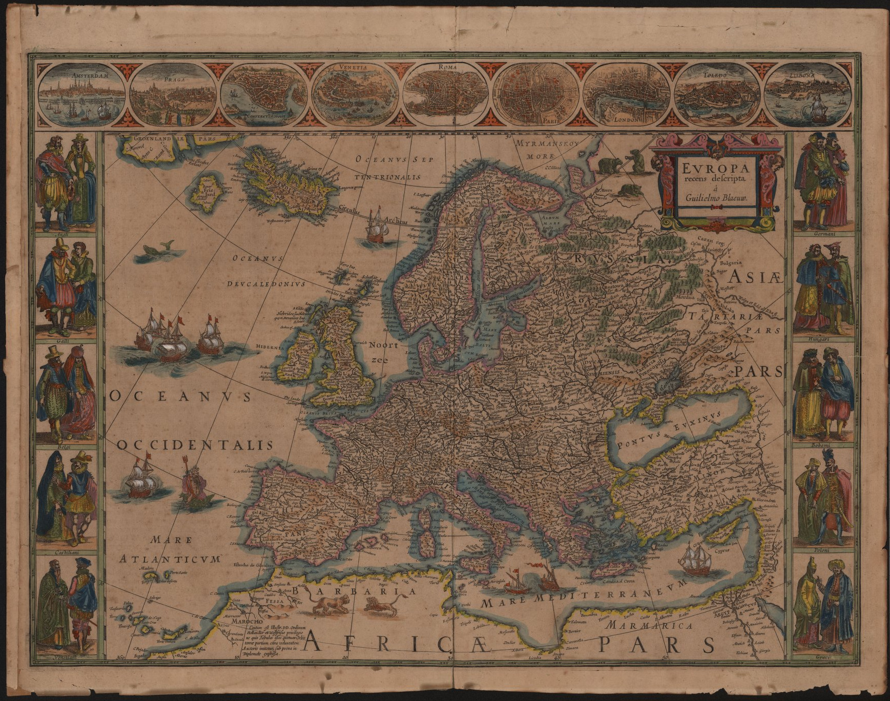
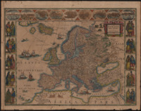
Europa recens descripta.
[Amsterdam, 1660].
Willem Janszoon Blaeu (1571-1638)
Europa recens descripta (Europe, newly depicted) is a beautiful map of the entire continent from a printing house known for its beautiful maps. Engraved and then hand-colored, the map features a mixture of Latin and vernacular placenames. Blaeu typically uses Latin for large regions and switches to the vernacular for more local names. In addition to the more usual locations, it also includes the island of Frisland near Iceland and Greenland, a nonexistent island first described in 1558 that appeared on various maps until the late seventeenth century. (It also appears on Ortelius’s Americae sive novi orbis, nova description and on Speed’s A New and Accurat Map of the World.) Recognizing his error, Blaeu would remove the island in later versions of this map. This particular copy of the map does not indicate national borders, though some colorists outlined different nations in different colors. As a result, the map seems to emphasize Europe as a whole rather than any individual national power.
Like many maps from Blaeu’s press, Europa recens descripta includes depictions of people from ten European cultures: the English, French, Belgians, Spanish, and Venetians on the left and the Germans, Hungarians, Bohemians (modern Czechs), Polish, and Greeks on the right. Note that there is no such thing as Italy yet: the kingdom of Italy had collapsed in the early Middle Ages and a unified Italian state would not remerge until the 19th century. The clothing worn by the figures is fairly generic with only occasional regional touches: the Belgian woman’s hat reappears on a Brabançon woman in Speed’s A New Mape of Ye XVII Provinces of Low Germanie, mended a new in manie places and one of the Greek men is wearing a yellow turban, likely a reference to the Ottoman Turks currently ruling Greece. These cartes-à-figures have been lavishly colored, as have the cities depicted across the top of the map.
On the map itself, the decorations are largely limited to the ocean and the Mediterranean, where the addition of an extra swirl of blue paint makes two classically designed triremes appear to be fighting. In the Atlantic, a modern ship sails alongside Neptune riding a large green fish and to the far north, a whale surfaces briefly. Also of note are the lions in Africa and the three green bears near the map’s title cartouche. The colorist has been very sparing with color on the continent but enthusiastically and carefully lends motion to the ocean where the engraved ships ride entirely hand-drawn waves.
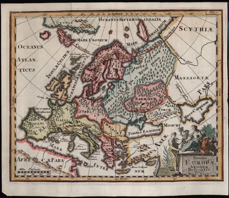
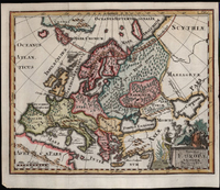
Summa Europae Antiquae Descriptio.
[Amsterdam, 1697].
Philipp Clüver (1580-1622)
Summa Europae Antiquae Descriptio (A depiction of all of ancient Europe) was almost certainly not drawn by Philipp Clüver himself: it first appeared posthumously in Clüver’s Introductio in universam geographiam, a six-volume work that commenced publication in 1624. Most likely, the map was based on Clüver’s descriptions. It is a map that speaks to Clüver’s longstanding interest in historical geography. It depicts not the Europe of his own day but a version of Europe derived from classical sources. A nod to the map’s origins in the classics is in the bottom right corner: the title of the map has been depicted as though it were carved into a stone block. Seated on top of the stone is Europa, the mythic namesake of the continent, recognizable by the bull lying beside her.
The map has been laid out to take into account the curvature of the Earth with lines of longitude that narrow as one goes north, following the guidelines of the classical geographer Claudius Ptolemy (ca. 100-170). At the far north lie the islands of Thule and Cronia. In the classical era, Thule was a term for the far north with the term “Ultima Thule” standing for the remotest place on Earth. On this map, Thule appears to represent Greenland with Cronia being Iceland, but the two islands could just as easily be fictional places that just happen to be in the general area of real landmasses.
Like all engraved maps, this map was printed in black and white and only subsequently hand-colored. The colorist used shades of red, green, and yellow to make different regions more clearly distinct. Just what the different colors represent is unclear: the red in the center of the map encompasses modern Germany and Scandinavia, i.e., the areas inhabited by speakers of Germanic languages, but the other regions do not correspond with historical linguistic groups. The green color may be intended to reflect the western Roman Empire, though the yellow does not map onto the eastern Empire as well.
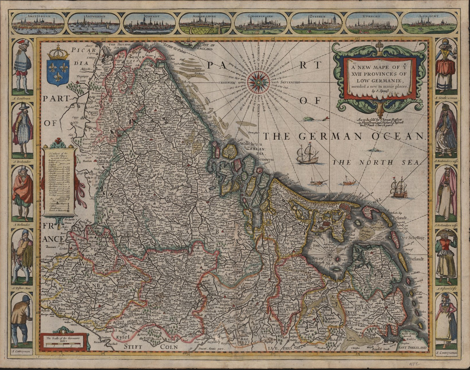
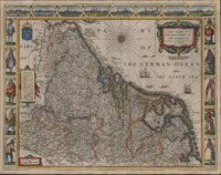
A New Mape of Ye XVII Provinces of Low Germanie, mended a new in manie places.
[London, 1627].
John Speed (1551/52-1629)
This map is oriented with towards the west rather than the north and depicts the seventeen provinces the Habsburg Netherlands, roughly equivalent to Holland, Belgium, and Luxembourg together with some of northern France. Made up of seventeen provinces, mostly counties and duchies, they were ruled first by the House of Burgundy and subsequently the House of Habsburg and treated as a single territorial bloc. The map was already politically inaccurate by the time it was published in 1627: the seven northern provinces had successfully seceded and formed the Dutch Republic in 1588, even if Spain would not formally recognize Dutch independence until 1648. The Dutch Republic, also known as the United Provinces, would prove to be an economic and military powerhouse until the end of the 19th century.
The North Sea is labeled as the “German Ocean,” a common name for this body of water since antiquity. (The name “North Sea” did not establish itself until the 17th century.) The map has been hand-colored with borders around different provinces, but has been applied only inconsistently: several provinces have been lumped together into a large green region. The map is a little difficult to read at times as the provinces’ names are spread out wherever there is room for their letters. The top of the map depicts major cities: Amsterdam, Antwerp, Ghent, Middelburg, Groningen, Zutphen, Utrecht, and Arras (called by its historical Dutch name “Atrecht”). Some effort seems to have been made to base them on their actual appearances: there are no fictional rivers or seas near any of them. The cities are evenly distributed between the modern Netherlands and Belgium, with one city in modern France.
The figures on the left and right side of the map depict different occupations but also different nationalities: we are shown the difference between a Brabander (today we might say a Brabançon) and a Hollander. The Duchy of Brabant, roughly in the center of the map, lies in modern Belgium while Holland hugs the coastline of the modern Netherlands, just to the west and north of Brabant and rimmed in yellow. The Brabançon woman on the right side of the map is wearing a distinctive round hat that may have been a predecessor of the poffer, a late 19th-century hat worn only by women in North Brabant. Brabant and Holland may well have been on mapmakers’ minds in the 1620s: Brabant was a powerful political force in the Low Countries while the cities of Amsterdam and Antwerp were producing many of the best maps available: Blaeu, Ortelius, and Mercator all published their atlases in Holland, to name only a few.
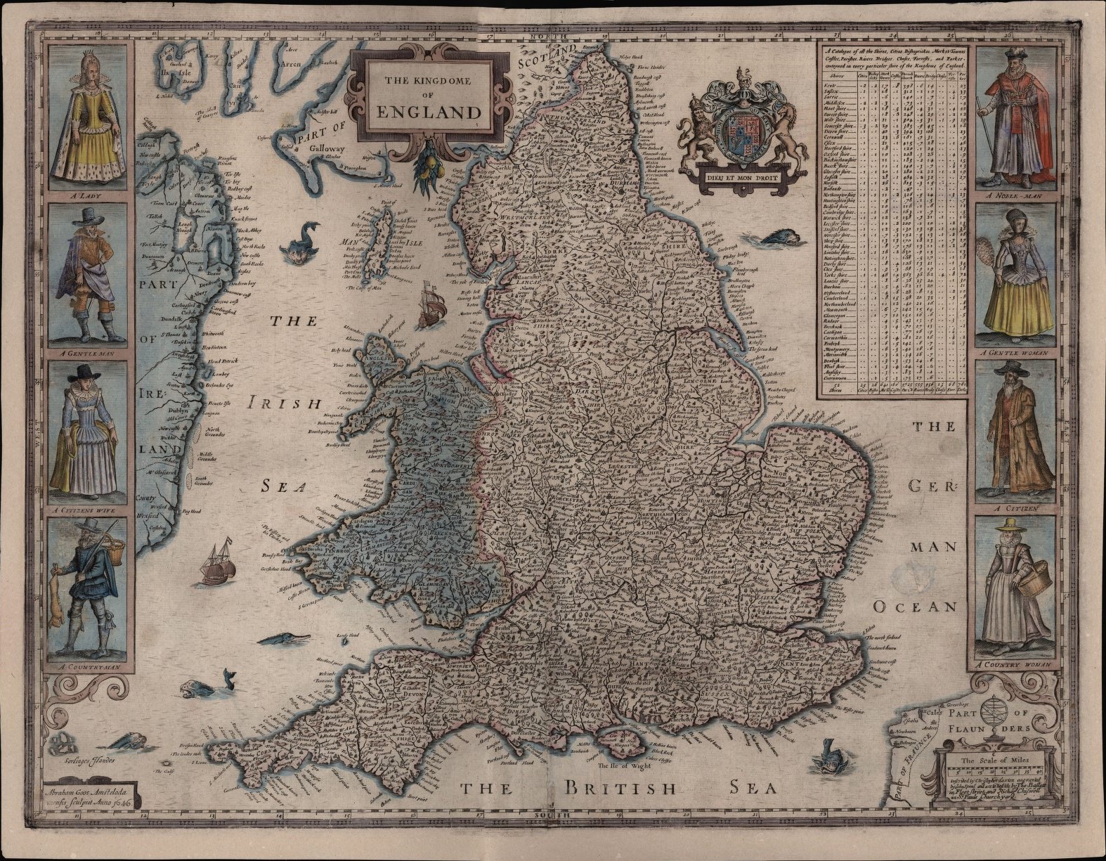
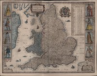
The Kingdome of England.
[London,] 1646.
Abraham Goos (fl. 1614-1643)
A version of this map first appeared in John Speed’s Theatre of the Empire of Great Britaine (1611) but the design of the book changed and after a few decades of use, the engraving had begun to wear out and a new one was required. The original plate had been done by Jodocus Hondius, a Flemish engraver, whereas the replacement was done by his uncle-in-law Abraham Goos, as a small Latin note in the bottom left corner indicates. The map is hand-colored by someone who subscribed to the idea that less is more: most of the color is concentrated in the decorations, especially the sea monsters, the ships, the coat of arms, and the figures on either side of the map.
It’s hard to tell just what period in British history this map is intended to represent. The coat of arms in the upper right corner was introduced by King James I in the 17th century to combine the English, Scottish, and Irish coats of arms, but the map is printed in the section of the book discussing the administrative practices of the early Norman kings. The colorist adds to the confusion by opting to color Wales and Ireland blue while the borders of both Scotland and England are fringed with blue. Maybe this was intended to highlight England as a separate part of “Great Britain,” though that doesn’t quite explain why Scotland remains uncolored.
The figures on the left and right side of the map depict different social classes in English society: nobility, gentry, citizenry, and country folk. Citizenship in early modern England meant an affiliation with a specific town or city rather than a nation; what we would today call a “citizen” was called a “subject.” The implicit hierarchy of the figures with nobility and gentry at the top suggests that townsfolk are higher status than country folk. All eight figures look very well-to-do, however, implying that the English are uniformly prosperous.
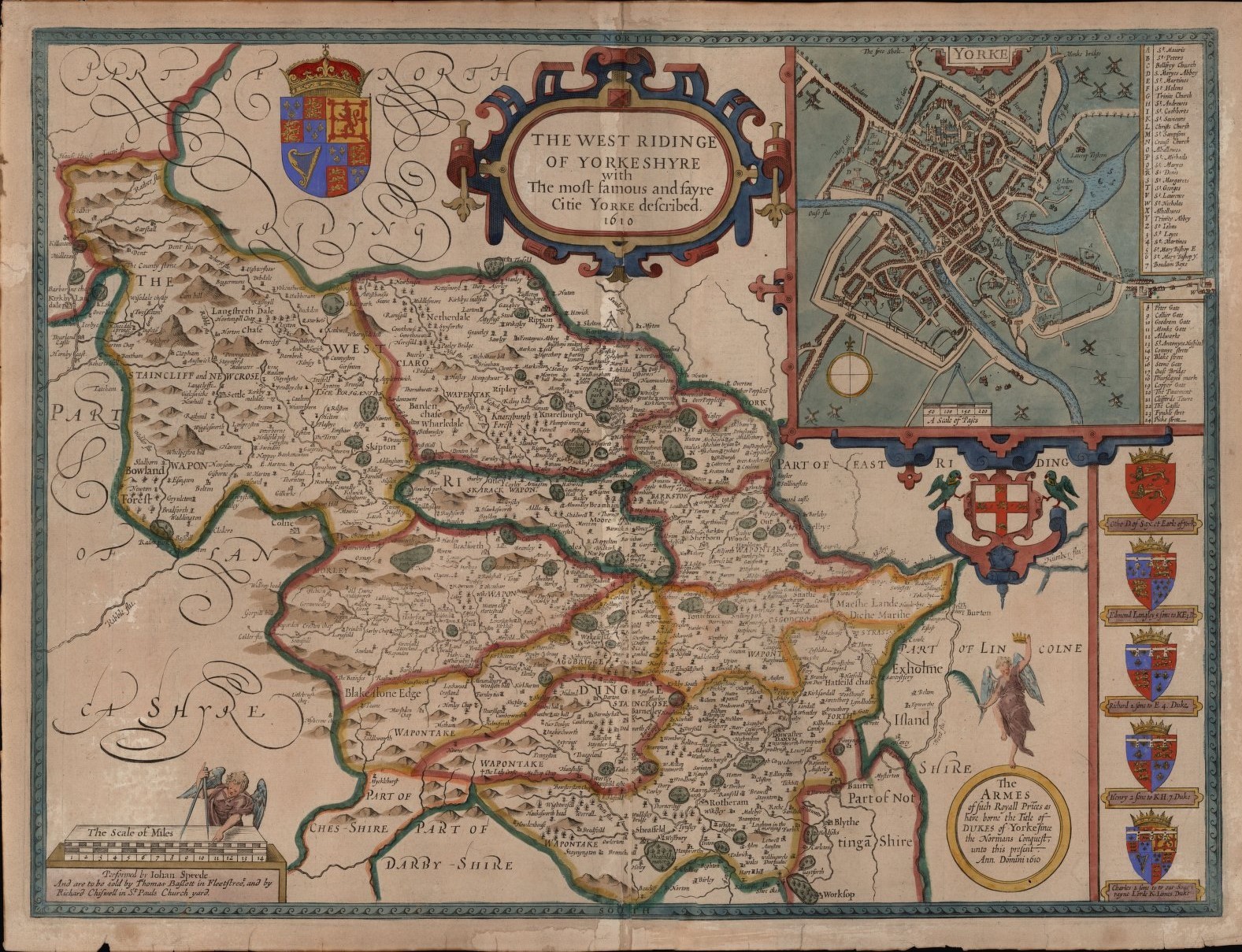
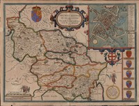
The West Ridinge of Yorkeshyre with the Most Famous and Fayre Citie Yorke Described.
[London,] 1610.
John Speed (1551/52-1629)
John Speed’s reputation as a cartographer was built on his mapping of English counties, a project he undertook in conjunction with his large antiquarian project The History of Great Britain (1611). His map of the West Riding showcases his typical attention to detail as well as his historical interests: he includes the coats of arms for five nobles who held the city as part of their lands: Otto of Brunswick (1175-1218), Edmund of Langley (1341-1402), Richard of Shrewsbury (1473-1483), Henry VIII (1491-1547), and Charles I (1600-1649). When the map first appeared, Charles I was still Prince Charles, second son of King James I, and his coat of arms may have appeared as a way of highlighting the contemporary nature of Speed’s book.
Norse words are scattered throughout the map. Starting in the late 9th century, Yorkshire was part of a Danish kingdom with York (called “Jorvik”) as the capital and linguistic traces of the Danish kingdom remained even after they had been driven out. The reason Yorkshire is divided into three “ridings” is because of the Danish subdivision called the “Þriðungr” or “third.” Similarly, there are numerous notes of “wapentake” (Norse: “vápnatak”) on the map, which indicate administrative subdivisions (equivalent to the “hundreds” in other parts of England). The wapentakes of the West Riding are all marked with a ring of color on their borders. Whoever did the coloring also put a green border around the West Riding as a whole, though they accidentally included parts of Cheshire and Nottinghamshire within the green border.
The inset of the city of York is delightful for a number of reasons, not least of which are the numerous windmills in the fields surrounding it. There are further Norse quirks in the legend at the far right: a first glance would suggest that York has an abundance of gates but not many streets. To this day, streets in York are called “gates” (from the Norse “gata”), gates are called “bars,” and bars are called “pubs.” None of the city’s four main bars are marked on the map, but we do see a few buildings and distinctive spaces that have been labeled directly on the map. Twenty-eight churches are listed and marked on the map, including the famous York minster, which is marked as “St. Peters” and is easily the largest building on the map. The abundance of churches on the map is a reflection of the old English practice of using parishes as an administrative subdivision, a practice that did not become formally secularized until the Victorian period.
Gallery of maps (click to enlarge).
N.B.: The descriptions of each map have been shortened to better fit in the captions in the gallery. For the full text, see above.
- Willem Blaeu's map of Europe, Europa recens descripta (Europe, newly depicted), 1660.
- Philipp Clüver’s map of Europe, Summa Europae Antiquae Descriptio (A depiction of all of ancient Europe), 1697.
- John Speed’s map of the Habsburg Netherlands, A New Mape of Ye XVII Provinces of Low Germanie, mended a new in manie places, 1627.
- Abraham Goos’s map of England, The Kingdome of England, 1646.
- John Speed’s map of western Yorkshire, The West Ridinge of Yorkeshyre with the Most Famous and Fayre Citie Yorke Described, 1610.