Places in the World: Treasures from the Venable Collection
Asia: Mapping A Place To Know It
The journey from Europe to Asia was a long and arduous one, but it was a journey that was undertaken with some regularity by merchants, missionaries, and adventurers. Silk, wool, precious metals, porcelain, spices, and many other goods were exchanged between Europe and Asia along caravan routes that are sometimes oversimply called “the Silk Road.” Trade and communication between west and east partially collapsed between the 7th and 13th centuries as the Roman Empire failed and Middle Eastern empires took its place as Asia’s main western trading partner, but the east remained a place of fascination and opportunity for Europeans. When the Mongols came to power in China, they re-established large-scale trade by land and sea, inadvertently kickstarting European exploration to the west as well, where they sought for centuries to find a direct sea route to Asia.
Commodities were not the only thing that was exchanged between Europe and Asia. Ideas and information flowed in both directions as well. As trade routes became more common and more lucrative, Europeans began to draw more and more precise maps of Asia, both of the continent as a whole and of specific regions within it. Many of these maps were less about navigation and more about imagination: most Europeans would never go to Asia themselves but wanted to be able to visualize it. New maps corrected old impressions of the world’s largest continent, some of them based on misunderstandings by early travelers, and improved Europeans’ ability to understand the eastern lands from which the desired silks, porcelain, and spices came.
Two of the maps in this gallery represent different stages of knowledge about Asia: we can see a dramatic increase in precision between Speed’s map and Vaugondy’s map a century later. Complementing them is Goeree’s map of a portion of the Middle East which served not traders but religious scholars. As you look at these maps, think about how maps allow us to travel mentally as well as physically. How does a map enable you to visualize a place and why is that important?

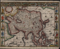
Asia with the Islands adioyning described, the atire of the people, and Townes of importance.
London, [1626].
John Speed (1551/52-1629)
John Speed’s map of Asia looks a bit squashed, an issue it shares in common with Matthäus Seutter’s Diversi Globi Terr-Aquei Statione variante et Visu intercedente (ca. 1740). The map does its best to mark as many settlements as possible and as such has comparatively little room left over for decorations beyond the trees and mountains used to represent different topography. There is, however, a little elephant near the Lake of Ciamay, a fictional lake that here serves as the source of several rivers. Lake Ciamay or Chimay appeared on maps from the 1550s until the early 1700s, at which point Jesuit missionaries had developed more thorough maps of the region.
The colorist appears to have chosen to mark the boundary between Asian and Europe as running between the Euxine (or “Black”) and White Seas, around 38 degrees eastern latitude. The engraving of the map does not differentiate between the two continents beyond labeling the upper left end of the map as being “Part of Europe” just as the portion of Africa that is visible in the lower left is labeled “Part of Africa and “Part of America” is visible in the upper right corner. Other versions of the map outlined different regions in different colors, so what we see here is a specific choice. The colorist also outlined the Great Wall of China in the upper third of the continent with the same color as the mountains; Speed notes that it is “A bulwarke consisting of 400 leagues in length erected by the king of China against the sudden infall of the Tartars of this side.”
Like many other early 17th-century maps, this one also features cartes-à-figures on the sides. They depict inhabitants of the lands being mapped, albeit without much reference to what people from those regions would actually have looked like. Included on the left are a Syrian, an Arab, an Armenian, a Sumatran, and an Indian from Balaghat; whereas included on the right are a Javan, a Moluccan, a Chinese, a western Russian, and a Tatar. The diversity of cultures represented, even if they are not depicted accurately, shows that Europeans knew about many peoples in Asia, since referring to “a Javan” requires people to have a sense of what Java was and that its inhabitants would be distinct from, say, Sumatrans.
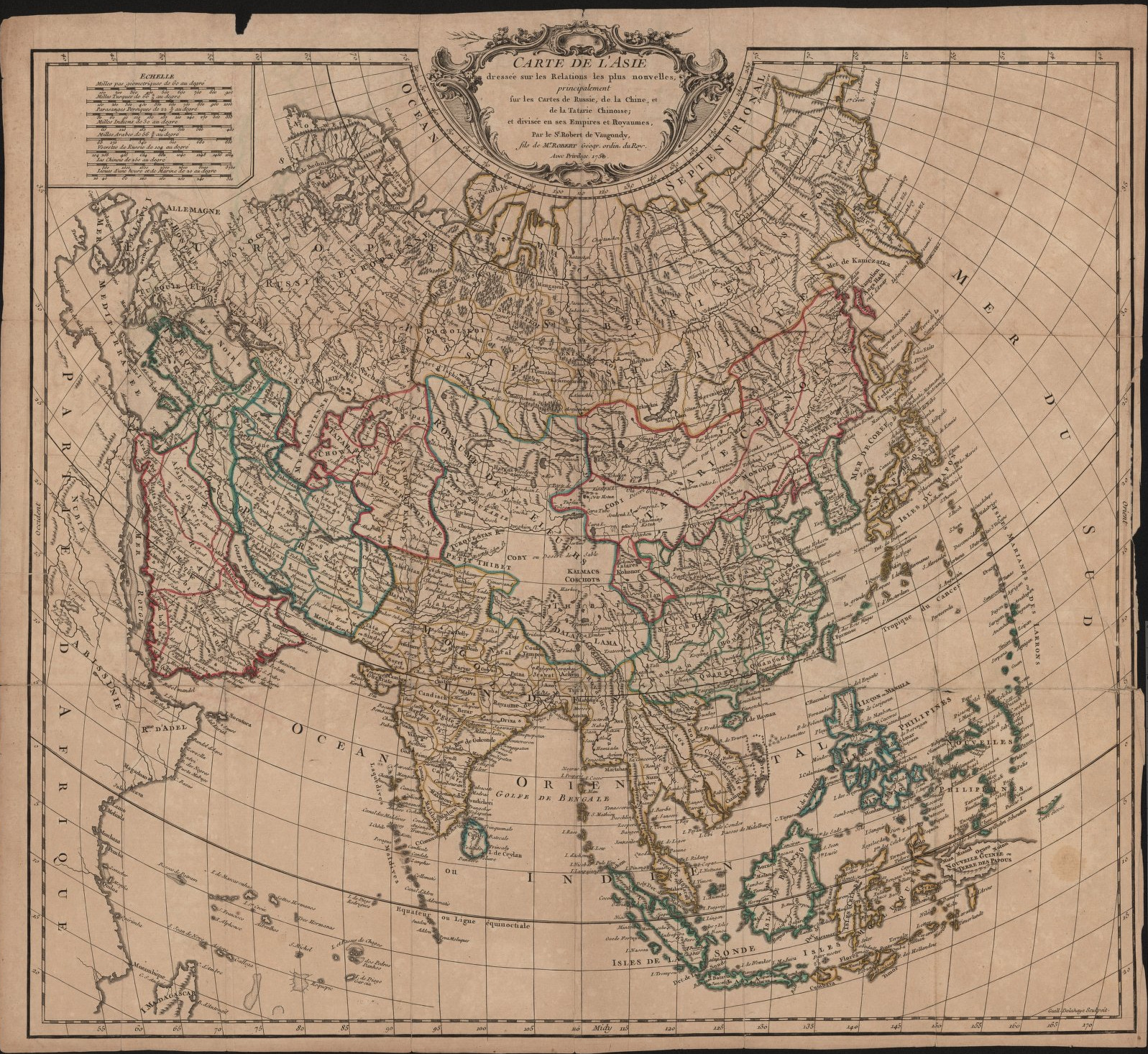
Carte de L’asie dresée sur les relations les plus nouvelles.
[Paris,] 1750.
Didier Robert de Vaugondy (1723-1796)
Carte de L’asie dresée sur les relations les plus nouvelles (A map of Asia drawn according to the newest reports) appeared a century later than Speed’s map and it shows. Jesuit cartographers at the Chinese imperial court had sent copies of their findings home, where they were combined with other information. Greater accuracy in terms of measurements results in a more accurate coastline and a less compressed projection. Japan has been shifted to a more accurate north-south axis rather than the almost east-west alignment shown in Speed. The focus of mapping has also shifted from settlements to terrain, so that although Vaugondy’s map is just as full of features as Speed’s, it is largely taken up by mountain ranges and rivers. The sole decoration on the map is the Baroque cartouche at the top with its swooping curves.
The map distinguishes between Tatary China (equivalent to the region sometimes called “Manchuria”) and China to the south. Vaugondy frequently notes the peoples who live in different regions, typically using small capital letters for their names. This may have been done to minimize confusion between the names of people and the names of locations, but he is not always consistent and also uses small caps to identify regions. Tibet (labeled “Thibet” in the center of the map) refers to the Tibetan plateau. The map notes “Dalai Lama” in large letters beneath it, apparently confusing the title of the Tibetan religious and temporal leader with either the territory or the people under his control.
Vaugondy often includes multiple names for the same features, noting for instance that the Gobi Desert (spelled variably as “Cobi” and “Coby” on the map) is called the “Chamo” by the Chinese. In the Philippines, the map indicates that Manila in the Philippines is also called “I Luçon,” possibly a reference to the Tagalong word “Luzon” for the largest island in the chain. In doing so, Vaugondy solves the problem of contradictory cartographic sources: rather than settling on a single name for a location, he offers multiple alternatives so that someone using his map can quickly find a region they are looking for regardless of which name they first encountered it as.

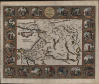
De Reys-togten van Abraham, gaande uit Ur der Kaldëen na Kanaan.
[Amsterdam, 1700].
Willem Goeree (1635-1711)
De Reys-togten van Abraham, gaande uit Ur der Kaldëen na Kanaan (The travel tours of Abraham, going from Ur to Chaldea after Canaan) is a map of the Middle East with a focus on sacred sites of the Hebrew Bible. Surrounding the map are twenty-one engraved medallions depicting the life of Abraham, starting in Genesis 12:4-5 when Abraham leaves his father’s house, and proceeding clockwise around the map to his burial in Genesis 25. A thin gold line traces Abraham’s journey from Ur in the east to Canaan, though it does not continue on to Egypt where Abraham lives during Genesis 12. The map is a little detached from biblical chronology: the Ishmaelites couldn’t have existed in Abraham’s day since they were the descendants of his son and Jerusalem is not named until Judges 19:10 but it appears on the map nevertheless. Rather than explicitly being a map of where Abraham traveled, then, the map helps identify spatial relationships between places mentioned in the Hebrew Bible.
Goeree was not alone in his fascination with the mapping of the Holy Land: the Reformation had led to a heavy demand for maps of Palestine both as Bibles and as stand-alone prints, with Luther himself wanting to include a map in his 1522 Bible. Maps of the Holy Land could be used as tools in scriptural exegesis, the careful interpretation of scripture. The Bible often provides names and places for specific events but as most readers of the Bible had never been to Palestine themselves, those names meant comparatively little. Maps grounded events in the Bible, emphasizing their historicity as well as their religious significance.
The map is largely left uncolored except for a few dabs of color on coastlines and dabs of red paint to highlight towns. Most of the colorist’s attention was instead dedicated to the medallions around the border of the map. The small size of the illustrated scenes requires a simple approach to coloring: in most of the scenes, characters wear clothing of only one color, which makes them easy to distinguish from one another in the scene. The simple coloring accentuates the engraved details, which include shadows and sometimes even act as color in their own right (see for instance Genesis 14:14-17 in the bottom right corner).
Gallery of maps (click to enlarge).
N.B.: The descriptions of each map have been shortened to better fit in the captions in the gallery. For the full text, see above.
- John Speed’s map of Asia, Asia with the Islands adioyning described, the atire of the people, and Townes of importance, 1626.
- Didier Robert de Vaugondy’s map of Asia, Carte de L’asie dresée sur les relations les plus nouvelles (A map of Asia drawn according to the newest reports), 1750.
- Willem Goeree’s map of the Middle East, De Reys-togten van Abraham, gaande uit Ur der Kaldëen na Kanaan (The travel tours of Abraham, going from Ur to Chaldea after Canaan).