Styled By Vespa
Title
Styled By Vespa
Creator
Krause, Zoe
Dube, Emma
Abstract
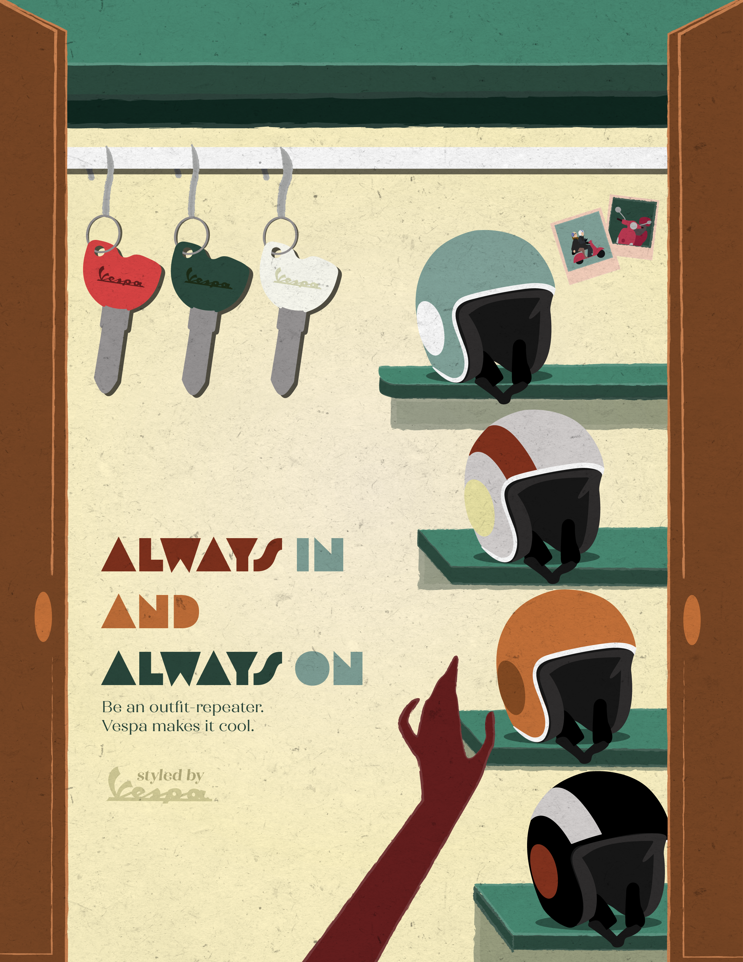
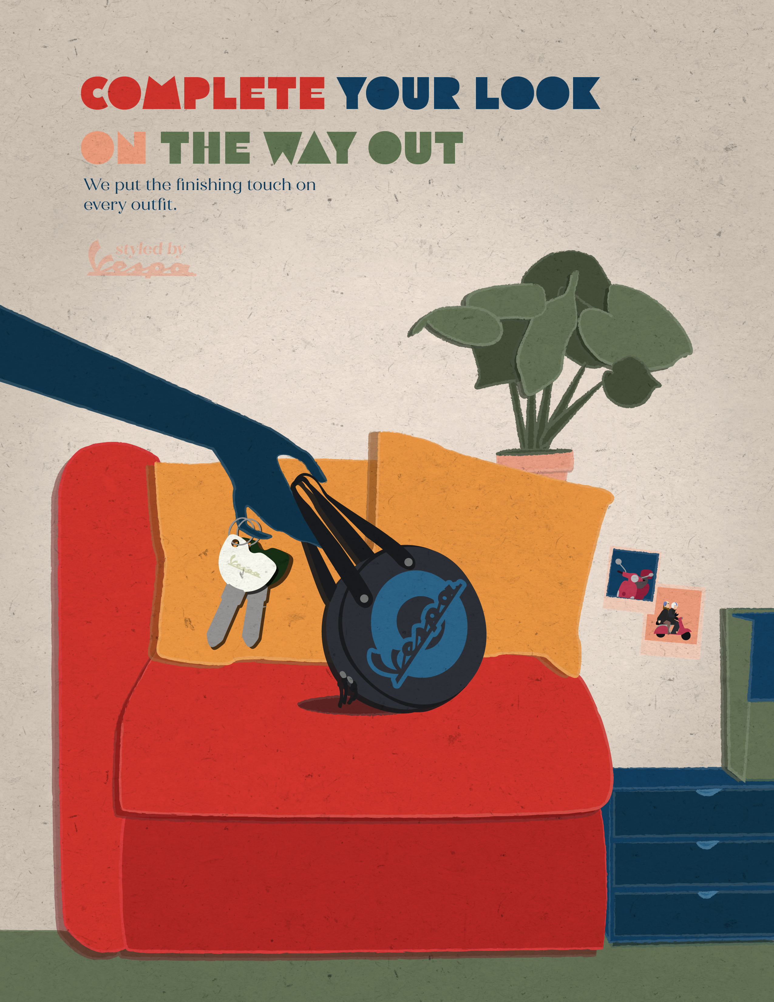
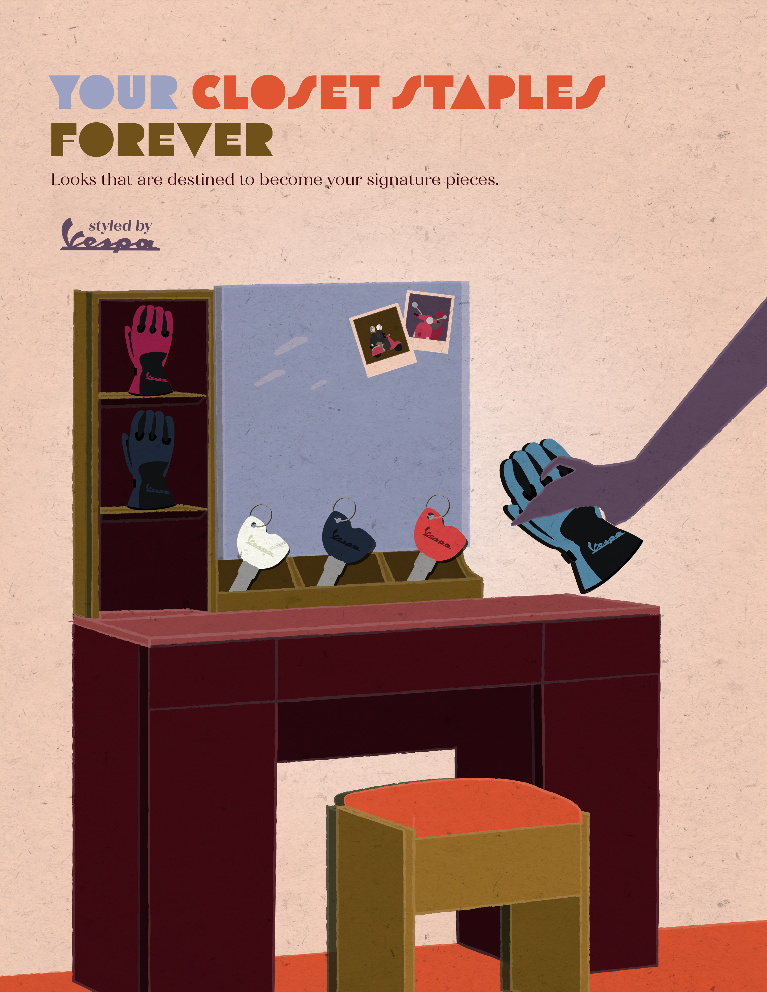
Our design highlights the craftsmanship of Vespa products through imagery and graphic style inspired by vintage Italian posters. Our goal is to showcase the brand’s heritage and longevity through thoughtful design choices.
We were inspired by the work of artists like Paolo Garretto (Lambretta, circa 1955) and Federico Seneca (Cioccolatini Perugina, 1928). Their poster designs and Italian heritage spoke to the Italian brand and led our decision making in typography, color, and composition. The rich and muted jewel tones with bold simple shapes guide our design in a direction reminiscent of their work. We wanted to highlight Vespa as classically Italian and infused with style through print ad design. We focused on Vespa accessories more than the actual scooter to frame Vespa as a lifestyle beyond their vehicles. Additionally, the choice to add texture creates a poster-like look to further drive home Vespa as a beautiful brand that’s art-worthy. If these ads were put into a print production for the masses, the goal is for these to stand alone as artistic posters that exhibit Vespa as a lifestyle choice. Vespa is worthy of their own illustrative posters.
Vespa is classic and stylish and should be represented as so. We aim to merge a brand with an aesthetic beyond their product to elevate and highlight their legacy.
Date Submitted
2024
2024
Citation
Krause, Zoe and Dube, Emma, “Styled By Vespa,” MU Libraries Digital Exhibits and Online Forums, accessed May 12, 2026, https://library.missouri.edu/exhibits/items/show/221.


Comments